Dried Palm
BGG 1721T
Cream
T181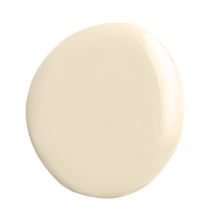
Picket Fences
BGG 1712P
Old Photo
N 3201P
September Rain x Cotton Candy
PB 1487P / CP178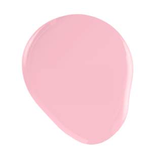
Zinnia Scent
R 1284P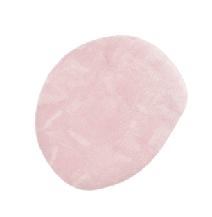
Giselle's Kiss
MS 115
Blue Star
PB 2819T
Green Gable
BGG 1813A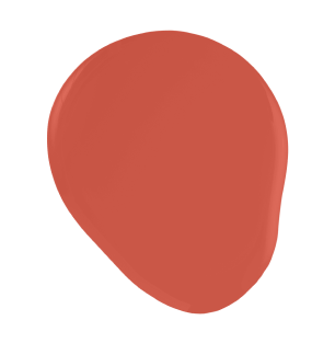
Watermelon Lolly
R 2369A
Soulmate
PB 1447P